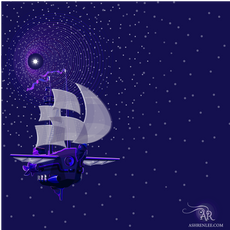
Exploring our new universe, the Polaris image-story began to unfold. A brand story is told through many smaller stories, each adding to and reflecting the larger story. It's the smell that takes you back to your mother's kitchen. The song that reminds you of your first love. The first picture of your newborn child. It's the thread that connects us to the important moments.
In platform terms that translates to wordmarks, icons, color schemes, backgrounds, typography and photography. As I said before, with the right story, the pieces tend to fall into place. There are always the exceptions. In this case, it was the wordmark, specifically the font choice. We must have gone through 100 options. I spent hours scouring the internet and creating test versions. In all fairness, Ash warned me from the start that picking the right font was her achilles heel. We went through three rounds of review before we found the right mix of Polaris, steampunk and readability. It was all deep blue skies and bright stars from there.


Kommentarer